
U by Kotex
Rebranding and integrated campaign of U by Kotex, the feminine care brand providing period protection products for women.
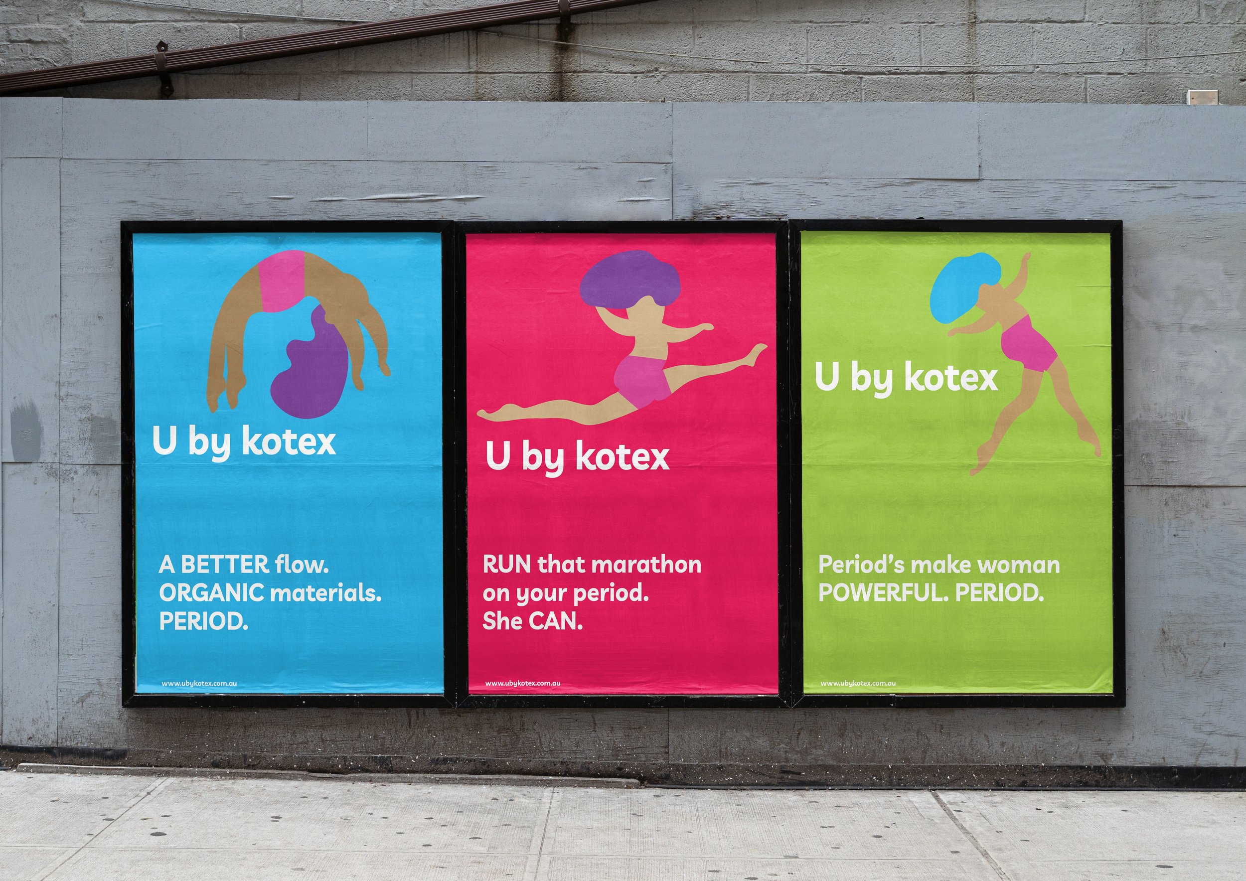


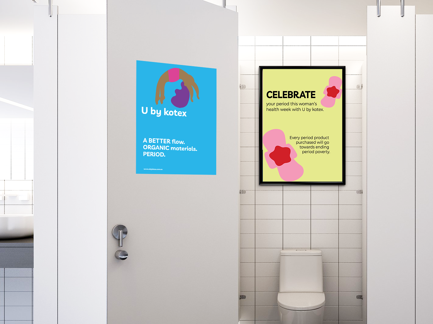

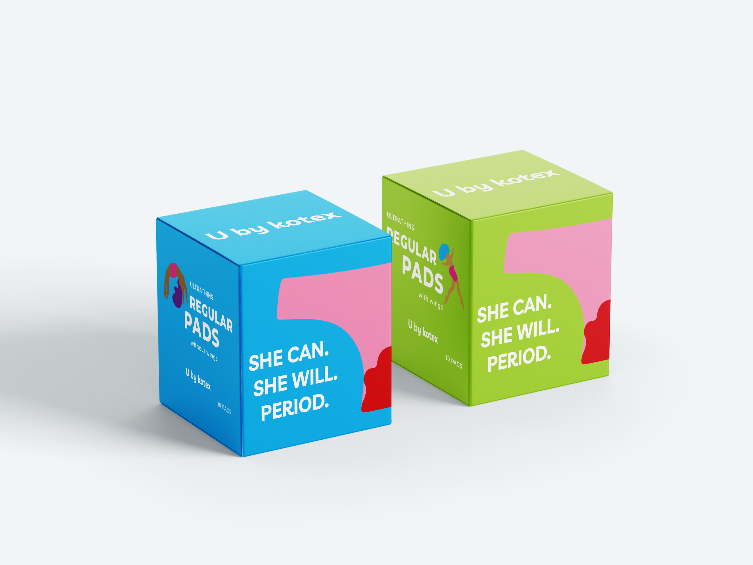
UbK aims to remove the taboo around periods, affirming they should not hinder women’s achievements. To promote this message, I have utilised a bold and courageous visual style with women empowerment at the forefront.
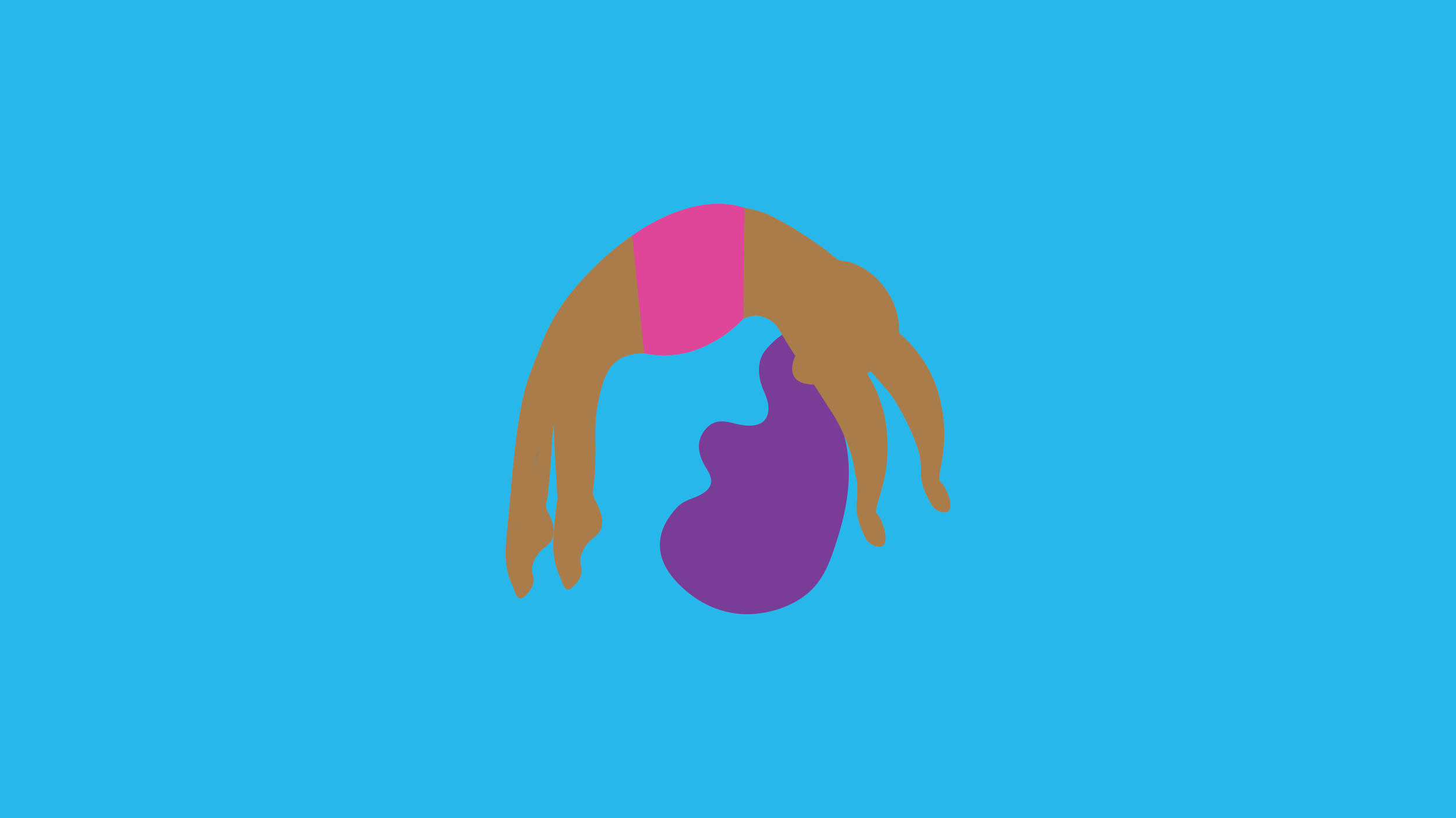

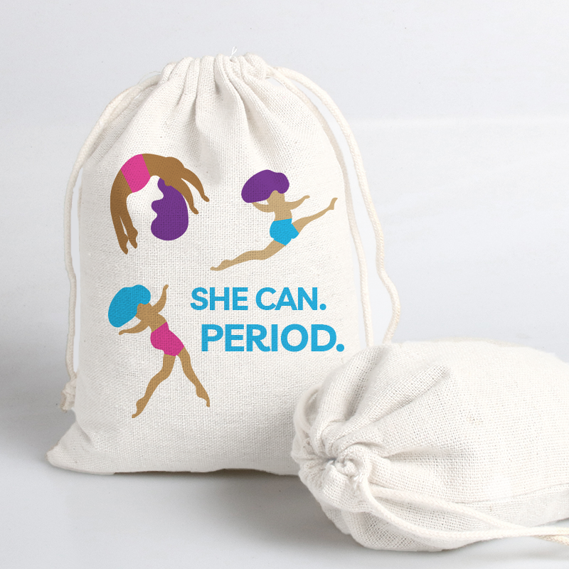
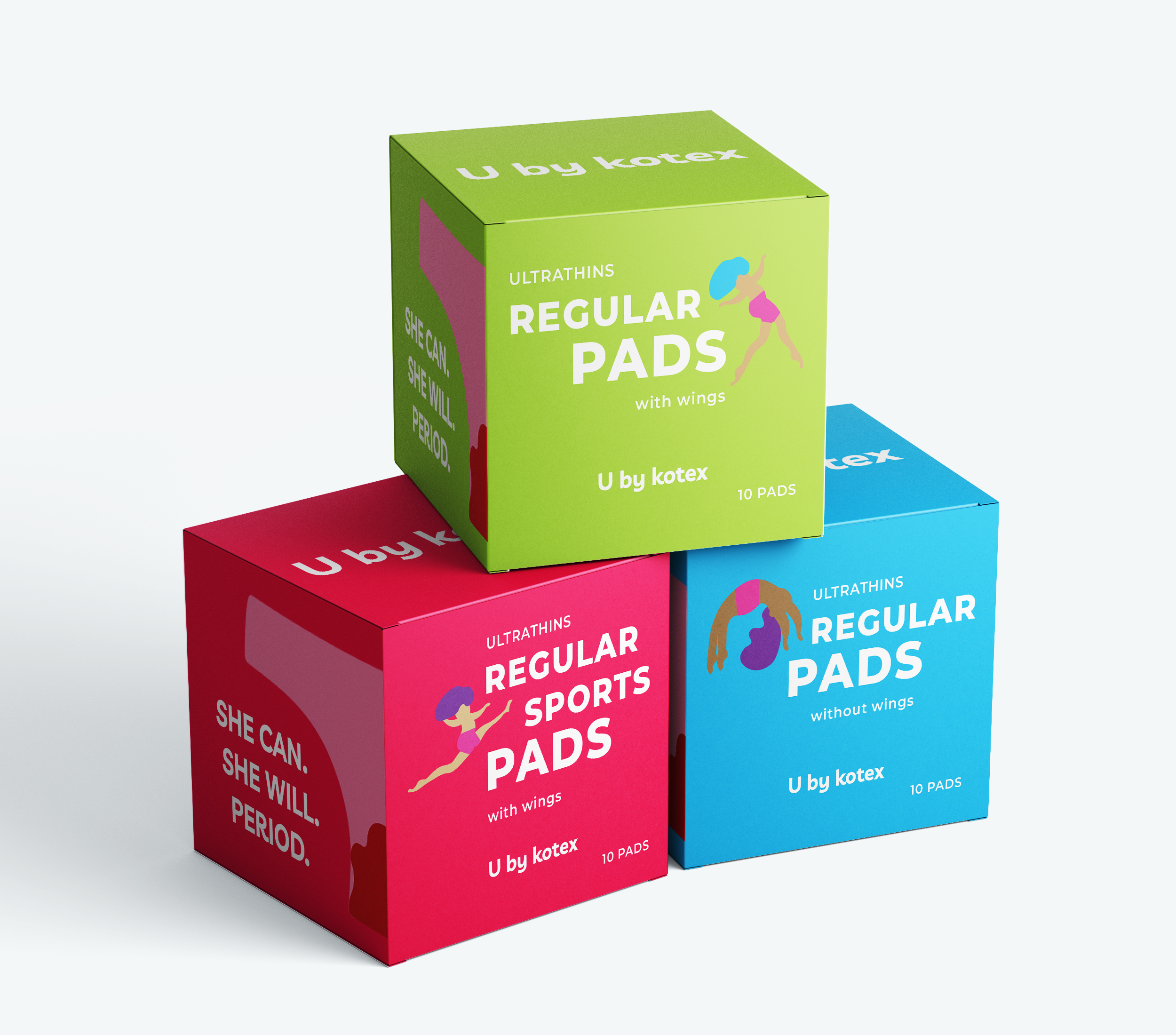
I have designed illustrations of women exercising whilst menstruating. I created illustrations because they are bold and universal, and clearly promote UbK’s message period or not, she can. I have selected a bright, bold colour scheme to stand out and encourage societal change.
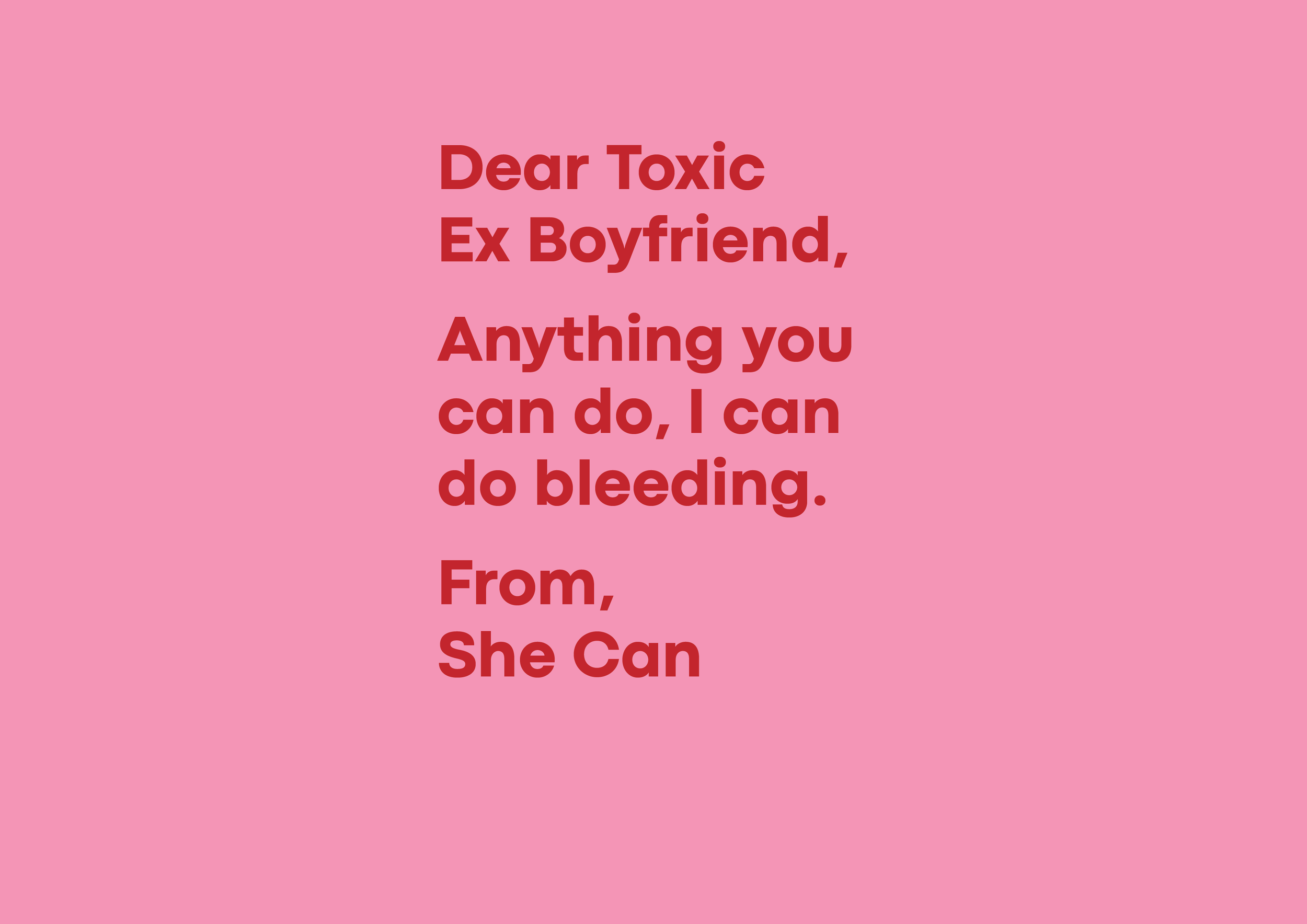
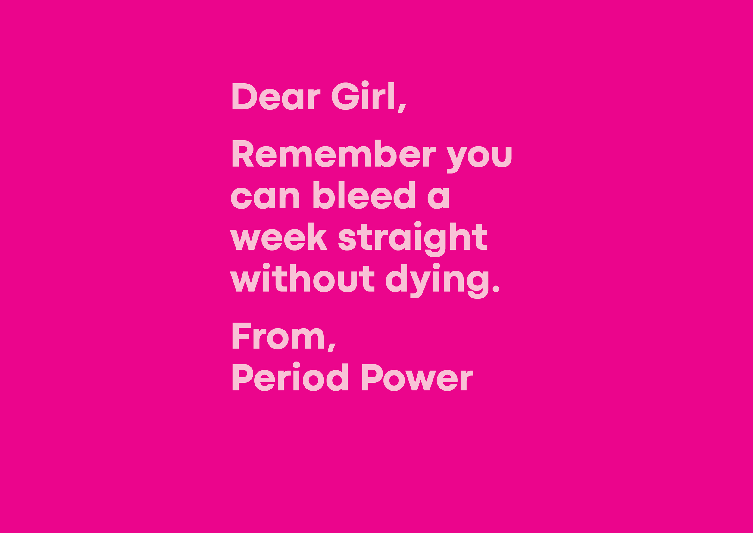
I was most excited by the typography and copywriting I created for the packaging. I created letters with humorous and empowering messages, to be relatable for women and help them feel confident on their period.
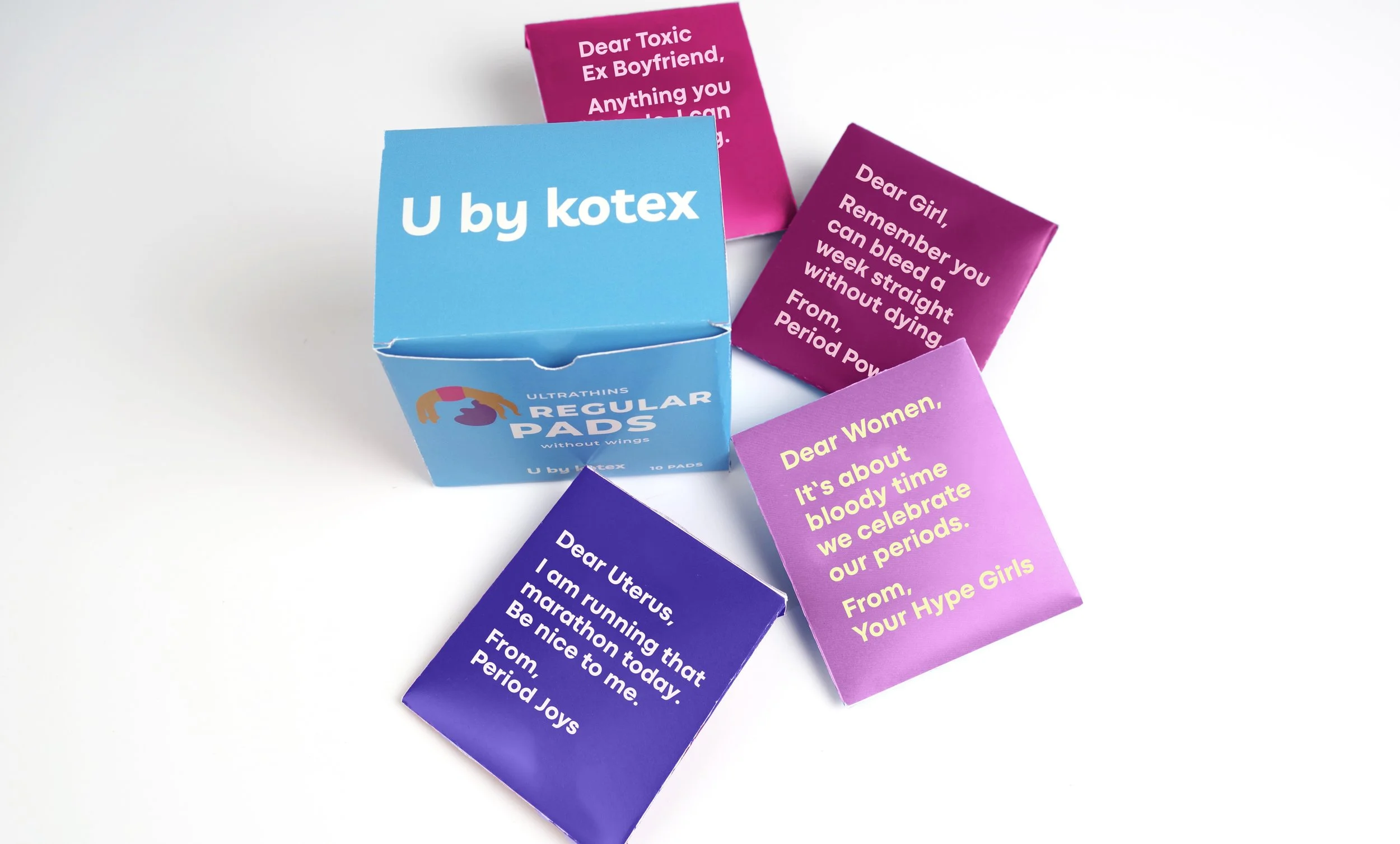
I have placed these letters on the back of envelopes which hold pads inside. I have done this to create a more enjoyable and funny experience for women on their period.
A packet of UbK’s pads are equivalent to 4 plastic bags and each individual pad is made of up to 90% plastic. To minimise waste, I have designed paper envelopes for the pads to be wrapped in instead of plastic. The envelopes will be used to dispose the pad.
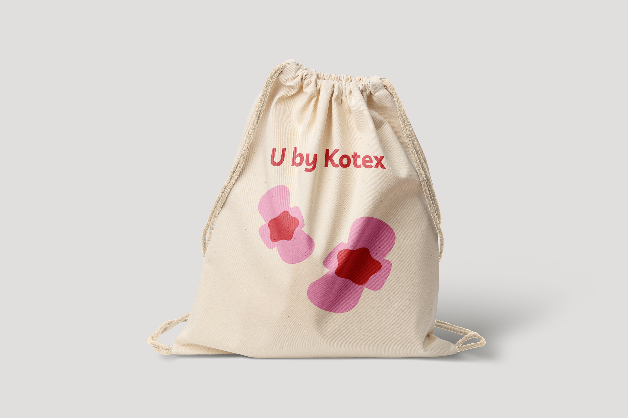
The pads sit inside linen reusable draw string bags, providing a convenient way for women to carry their pads.
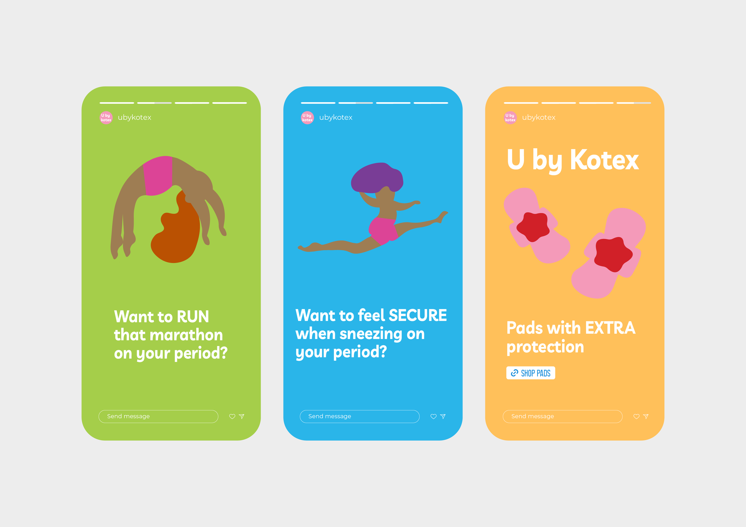
I created out of home advertising, Instagram stories and animation using Adobe After Effects for this campaign.
This project has taught me the influence that campaigns can have to create positive change in society. I was also able to progress my typography, illustration and copywriting skills.